Introduction to {epicrop}
{epicrop} provides an R package of the ‘EPIRICE’ model as described
in Savary et al. 2012. Default values derived from the
literature suitable for modelling unmanaged disease intensity of five
rice diseases, bacterial blight
(predict_bacterial_blight()); brown spot
(predict_brown_spot()); leaf blast
(predict_leaf_blast()); sheath blight
(predict_sheath_blight()) and tungro
(predict_tungro()) are provided. The model uses daily
weather data to estimate disease intensity. A function,
get_wth(), is provided to simplify downloading weather data
via the {nasapower}
package (Sparks 2018, Sparks 2020) and predict disease intensity of five
rice diseases using a generic SEIR model (Zadoks 1971) function,
SEIR().
Using the package functions is designed to be straightforward for
modelling rice disease risks, but flexible enough to accommodate other
pathosystems using the SEIR() function. If you are
interested in modelling other pathosystems, please refer to Savary
et al. 2012 for the development of the parameters that were
used for the rice diseases as derived from the existing literature and
are implemented in the individual disease model functions.
Get weather data
The most simple way to use the model is to download weather data from
NASA POWER using get_wth(), which provides the data in a
format suitable for use in the model and is freely available. See the
help file for naspower::get_power() for more details of
this functionality and details on the data (Sparks 2018, Sparks
2020).
# Fetch weather for year 2000 season at the IRRI Zeigler Experiment Station
wth <- get_wth(
  lonlat = c(121.25562, 14.6774),
  dates = c("2000-01-01", "2000-12-31")
)

wth
## YYYYMMDD DOY TEMP RHUM RAIN LAT LON
## 1: 2000-01-01 1 24.38 91.25 14.93 14.6774 121.2556
## 2: 2000-01-02 2 24.27 90.88 6.96 14.6774 121.2556
## 3: 2000-01-03 3 23.82 88.38 2.28 14.6774 121.2556
## 4: 2000-01-04 4 23.68 88.00 0.87 14.6774 121.2556
## 5: 2000-01-05 5 24.11 88.12 0.43 14.6774 121.2556
## ---
## 362: 2000-12-27 362 24.46 92.50 21.15 14.6774 121.2556
## 363: 2000-12-28 363 24.64 91.94 6.01 14.6774 121.2556
## 364: 2000-12-29 364 24.58 90.81 5.49 14.6774 121.2556
## 365: 2000-12-30 365 25.31 86.25 2.07 14.6774 121.2556
## 366: 2000-12-31 366 24.48 87.81 3.45 14.6774 121.2556Predict bacterial blight
All of the predict_() family of functions work in
exactly the same manner. You provide them with weather data and an
emergence date, that falls within the weather data provided, and they
will return a data frame of disease intensity over the season and other
values associated with the model. See the help file for
SEIR() for more on the values returned.
# Predict bacterial blight intensity for the year 2000 wet season at IRRI
bb_wet <- predict_bacterial_blight(wth, emergence = "2000-07-01")
summary(bb_wet)## simday dates sites latent
## Min. : 1.00 Min. :2000-07-01 Min. : 100.0 Min. : 0.0000
## 1st Qu.: 30.75 1st Qu.:2000-07-30 1st Qu.: 933.1 1st Qu.: 0.7071
## Median : 60.50 Median :2000-08-29 Median :1827.5 Median : 12.4138
## Mean : 60.50 Mean :2000-08-29 Mean :1622.2 Mean : 65.0439
## 3rd Qu.: 90.25 3rd Qu.:2000-09-28 3rd Qu.:2360.5 3rd Qu.:126.2923
## Max. :120.00 Max. :2000-10-28 Max. :2622.9 Max. :264.3734
## infectious removed senesced rateinf rtransfer
## Min. : 0.00 Min. : 0.00 Min. : 0.0 Min. : 0.0000 Min. : 0.00
## 1st Qu.: 1.00 1st Qu.: 0.00 1st Qu.: 113.4 1st Qu.: 0.0000 1st Qu.: 0.00
## Median : 17.74 Median : 1.00 Median : 642.6 Median : 0.9286 Median : 0.00
## Mean :214.99 Mean : 29.83 Mean : 803.0 Mean :11.3325 Mean :10.66
## 3rd Qu.:379.33 3rd Qu.: 16.12 3rd Qu.:1410.1 3rd Qu.:19.6572 3rd Qu.:16.29
## Max. :953.22 Max. :352.64 Max. :2286.4 Max. :64.5756 Max. :64.58
## rgrowth rsenesced diseased intensity
## Min. : 9.688 Min. : 1.000 Min. : 0.000 Min. :0.00000
## 1st Qu.:22.659 1st Qu.: 9.331 1st Qu.: 1.707 1st Qu.:0.00191
## Median :33.172 Median :22.890 Median : 31.153 Median :0.01194
## Mean :40.322 Mean :19.449 Mean : 309.862 Mean :0.10512
## 3rd Qu.:57.583 3rd Qu.:26.081 3rd Qu.: 619.724 3rd Qu.:0.21246
## Max. :79.689 Max. :50.029 Max. :1342.865 Max. :0.43496
## AUDPC lat lon
## Min. :12.4 Min. :14.68 Min. :121.3
## 1st Qu.:12.4 1st Qu.:14.68 1st Qu.:121.3
## Median :12.4 Median :14.68 Median :121.3
## Mean :12.4 Mean :14.68 Mean :121.3
## 3rd Qu.:12.4 3rd Qu.:14.68 3rd Qu.:121.3
## Max. :12.4 Max. :14.68 Max. :121.3Plotting using {ggplot2}
The data are in a wide format by default and need to be converted to long format for use in {ggplot2} if you wish to plot more than one variable at a time.
##
## Attaching package: 'tidyr'
## The following object is masked from 'package:testthat':
##
## matchesWet season sites
The model records the number of sites for each bin daily; this can be graphed as follows.
dat <- pivot_longer(
  bb_wet,
  cols = c("diseased", "removed", "latent", "infectious"),
  names_to = "site",
  values_to = "value"
)

ggplot(data = dat,
       aes(
         x = dates,
         y = value,
         shape = site,
         linetype = site
       )) +
  labs(y = "Sites",
       x = "Date") +
  geom_line(aes(group = site, colour = site)) +
  geom_point(aes(colour = site)) +
  theme_classic()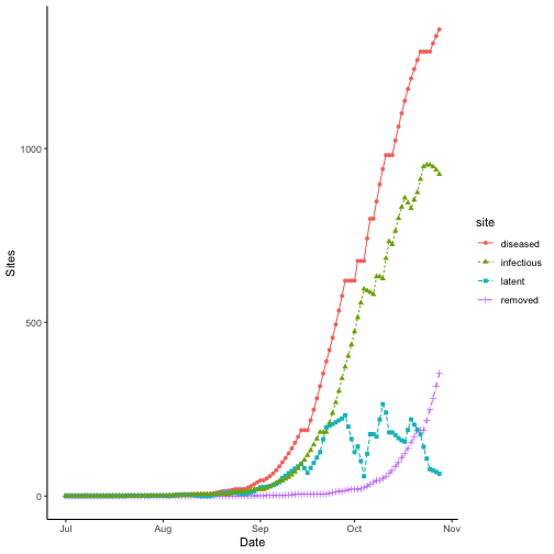
Site states over time for bacterial blight. Results for wet season year 2000 at IRRI Zeigler Experiment Station shown. Weather data used to run the model were obtained from the NASA Langley Research Center POWER Project funded through the NASA Earth Science Directorate Applied Science Program.
Wet season intensity
Plotting intensity over time does not require any data manipulation.
ggplot(data = bb_wet,
       aes(x = dates,
           y = intensity * 100)) +
  labs(y = "Intensity (%)",
       x = "Date") +
  geom_line() +
  geom_point() +
  theme_classic()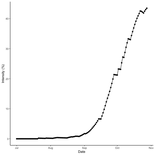
Wet season disease intensity over time for bacterial blight. Results for wet season year 2000 at IRRI Zeigler Experiment Station shown. Weather data used to run the model were obtained from the NASA Langley Research Center POWER Project funded through the NASA Earth Science Directorate Applied Science Program.
Comparing epidemics
The most common way to compare disease epidemics in botanical
epidemiology is to use the area under the disease progress curve (AUDPC)
(Shaner and Finney 1977). The AUDPC value for a given simulated season
is returned as a part of the output from any of the disease simulations
offered in {epicrop}. You can find the value in the AUDPC
column. We can compare the dry season with the wet season by looking at
the AUDPC values for both seasons.
bb_dry <- predict_bacterial_blight(wth = wth, emergence = "2000-01-05")
summary(bb_dry)
## simday dates sites latent
## Min. : 1.00 Min. :2000-01-05 Min. : 100.0 Min. : 0.000
## 1st Qu.: 30.75 1st Qu.:2000-02-03 1st Qu.: 932.7 1st Qu.: 0.000
## Median : 60.50 Median :2000-03-04 Median :2494.0 Median : 3.499
## Mean : 60.50 Mean :2000-03-04 Mean :1846.3 Mean : 15.689
## 3rd Qu.: 90.25 3rd Qu.:2000-04-03 3rd Qu.:2598.9 3rd Qu.: 20.839
## Max. :120.00 Max. :2000-05-03 Max. :2714.5 Max. :139.262
## infectious removed senesced rateinf
## Min. : 0.00 Min. : 0.00 Min. : 0.0 Min. : 0.0000
## 1st Qu.: 1.00 1st Qu.: 0.00 1st Qu.: 113.4 1st Qu.: 0.0000
## Median : 16.03 Median : 1.00 Median : 641.4 Median : 0.0000
## Mean : 66.40 Mean : 16.69 Mean : 823.4 Mean : 2.6149
## 3rd Qu.:115.30 3rd Qu.: 17.03 3rd Qu.:1446.5 3rd Qu.: 0.5386
## Max. :256.91 Max. :109.70 Max. :2300.1 Max. :39.2813
## rtransfer rgrowth rsenesced diseased
## Min. : 0.0000 Min. : 9.688 Min. : 1.000 Min. : 0.000
## 1st Qu.: 0.0000 1st Qu.:28.311 1st Qu.: 9.327 1st Qu.: 2.179
## Median : 0.0000 Median :34.267 Median :24.997 Median : 28.878
## Mean : 2.6149 Mean :42.212 Mean :19.566 Mean : 98.776
## 3rd Qu.: 0.5386 3rd Qu.:57.742 3rd Qu.:26.886 3rd Qu.:174.526
## Max. :39.2813 Max. :79.485 Max. :47.858 Max. :313.789
## intensity AUDPC lat lon
## Min. :0.00000 Min. :3.576 Min. :14.68 Min. :121.3
## 1st Qu.:0.00234 1st Qu.:3.576 1st Qu.:14.68 1st Qu.:121.3
## Median :0.01105 Median :3.576 Median :14.68 Median :121.3
## Mean :0.03012 Mean :3.576 Mean :14.68 Mean :121.3
## 3rd Qu.:0.05569 3rd Qu.:3.576 3rd Qu.:14.68 3rd Qu.:121.3
## Max. :0.10021 Max. :3.576 Max. :14.68 Max. :121.3Dry season intensity
Check the disease progress curve for the dry season.
ggplot(data = bb_dry,
       aes(x = dates,
           y = intensity * 100)) +
  labs(y = "Intensity (%)",
       x = "Date") +
  geom_line() +
  geom_point() +
  theme_classic()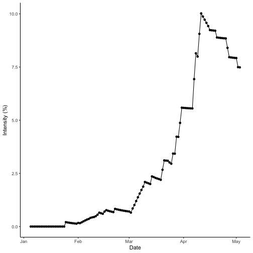
Dry season site states over time for bacterial blight. Results for dry season year 2000 at IRRI Zeigler Experiment Station shown. Weather data used to run the model were obtained from the NASA Langley Research Center POWER Project funded through the NASA Earth Science Directorate Applied Science Program.
As the AUDPC value is found in the AUDPC column and is
repeated for every row of the data.table so we only need to
access the first row. We can easily do this by calling the column using
the $ operator and [] to select an index
value, in this case the first row of the data.table.
Optionally if you wished to used {dplyr} you could use the
dplyr::distinct() function, which is demonstrated in the
“Mapping Simulations” vignette.
# Dry season
bb_dry$AUDPC[1]
## [1] 3.57641
# Wet season
bb_wet$AUDPC[1]
## [1] 12.39699The AUDPC of the wet season is greater than that of the dry season. Checking the data and referring to the curves, the wet season intensity reaches a peak value of 43% and the dry season tops out at 10%. So, this meets the expectations that the wet season AUDPC is higher than the dry season, which was predicted to have less disease intensity.
References
Serge Savary, Andrew Nelson, Laetitia Willocquet, Ireneo Pangga and Jorrel Aunario. Modeling and mapping potential epidemics of rice diseases globally. Crop Protection, Volume 34, 2012, Pages 6-17, ISSN 0261-2194 DOI: 10.1016/j.cropro.2011.11.009.
Gregory Shaner and R. E. Finney. “The effect of nitrogen fertilization on the expression of slow-mildewing resistance in Knox wheat. Phytopathology Volume 67.8, 1977, Pages 1051-1056.
Adam Sparks (2018). nasapower: A NASA POWER Global Meteorology, Surface Solar Energy and Climatology Data Client for R. Journal of Open Source Software, 3(30), 1035, DOI: 10.21105/joss.01035.
Adam Sparks (2020). nasapower: NASA-POWER Data from R. R package version 3.0.1, URL: https://CRAN.R-project.org/package=nasapower.